10 Simple CSS Tips and Tricks for Better Web Design and Usability
If your website doesn’t achieve the success you’re hoping for, it might be due to a very simple reason: bad design. While professional templates are hard to achieve for a non-designer, these simple CSS tweaks can dramatically improve your design, make it more accessible, and make it more efficient.
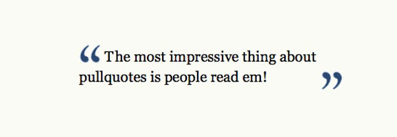
1. Nice Pull Quotes
Using the blockquote HTML tag is a good practice that many web writers use to differentiate quoted text from the rest. However, you can improve the rendering of these by tuning it with CSS. Adding nice typographic quotes and a background color will make your citations really stand out.
Tutorial on SitePoint

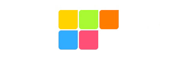
2. Background Images for Bullets
Bulleted lists are a nice way to display links, archives, or categories but they do look very common and fail to blend into your site’s design if to stick to displaying default bullet points. Did you know that you can replace these bullets with custom images? Doing this, you’ll have a more coherent design.
Tutorial on MaxDesign - Tutorial on MacWorld
3. Rounded Corners
When creating a box in your design using basic HTML and CSS, it will look very square with hard corners. You can smooth those out and make them look less aggressive using one of these two easy techniques.
Tutorial using images - Tutorial without images
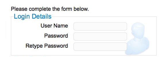
4. Styling Your Forms With CSS and Labels
Unfortunately, it is still very common to see people use tables to align their forms. It is actually easier and more accessible to use CSS and labels to achieve this.
Tutorial on Pete Freitag’s blog
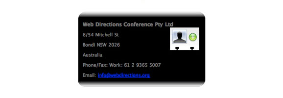
5. Styling hCard with CSS
hCard is a simple, open, distributed format for representing people, companies or organizations using a 1:1 representation of vCard properties and values in semantic HTML or XHTML. It is a nice way to display your contact information and it is easy to set up using the hcard creator.
Tutorial on 24Ways
![]()
6. Creating Your Print Stylesheet
If your article is long, chances are that people will want to print it out to read it. Improving the layout of the printed version is quite quick to do, so why don’t you do it?
Documentation on CSS discuss
![]()
7. Link Labeling
Ever clicked a linked and been taken to a PDF, DOC or MP3 file? Remember how annoying it was? Knowing this, you should be kind to your visitors and give them a way to know what kind of file a link will open. This can be done by adding a little application icon using the following technique.
Tutorial on Maratz.com
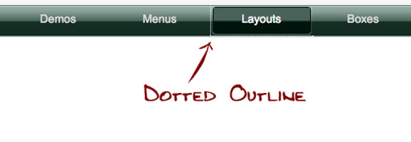
8. Removing Dotted Outlines
Ever notice this dotted outline coming around focused or active anchor links? It makes your site look less professional, so you should get rid of it using the following technique.
Tutorial on CSS tricks
9. Image Replacement for Submit Buttons
There are three ways to deal with submit buttons when designing: leave the default browser button, customize the background and border with CSS, or replace the button with an image. The last solution is the one that will blend in with the rest of the design the best.
Tutorial on Ampsoft
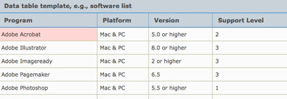
10. Styling Tables with CSS
Even though you should avoid using HTML tables for layout purposes, there are still cases where it’s the best solution, such as for presenting tabular data.
Tutorial for zebra table with CSS on A List Apart - How to style tables with CSS
This article was written by Mirko Humbert, a Swiss designer running a popular design blog.

Excellent article these are quite some helpful CSS style tips especially the Links Labeling “bravo” . One of my favorite CSS style tricks or tips however you’d like to call it is this one using the CSS to create an image map
(http://www.frankmanno.com/ideas/css-imagemap/)
Hope You Enjoy,
WebPrise
Hi Great tutorial, love the tips. I’m designing a new site now so will use the inspiration.
Cool tips. I’m more and more becoming a fan of details, and they really do make a piece pop.
[...] 10 CSS Tips for a Web Design that Sucks! [...]
just stumbled across this article….very useful for me, thank you very much!
more use of blockquotes me thinks
great tips, got to say though that would have prefered having the titles and then the images.
its all a bit too confusing.
[...] you want to read one of my latest articles, check out my 10 CSS tips on Templates [...]
I would recommend against #8. If a user is tabbing through links on your site, outline is there to show them what they have selected and so shouldn’t be disabled. Even if you declare highly visible styles for :active and :focus, users may not understand as they are accustomed to the dotted outlines.
I also agree with james, removing the focus on links is a very bad idea as they are an important navigational aid for impaired users who use the keyboard as a means of navigating around your site. It sometimes can look unsightly, especially when using image replacement techniques but it is important for accessibly that the focus on links is kept.
Sorry, but this article is, for the most part, cack! Especially point 8. That dotted outline is an accessibility feature and the notion that it’s unprofessional is laughable.
The info isn’t necessarily wrong, but just pointless and miss informed I think.
good points. i’m surprised by the amount of pages i’ve seen with the dotted link border — in a case where it definitely should be removed: for links where the text is hidden/indented off the screen. leaves a long dotted line across the entire page. yuck!
You shouldnt remove the dotted outline unless its for a tab or some kind of javascript interface and if you do replace it, do so using blur(). Dotted outlines are part of the browser’s UI that is helpful in assisting people find what they last clicked on.
This is an excellent article. It’s for sure helpful for the non-designers and newbies.
enjoy
i was looking 3. Rounded corners .. base and now i have it . thank again for this awesome article
[...] article on simple CSS tweaks that can dramatically improve your [...]
Hi This really interesting Article. Its will helps to those who have not idea about css which helps in web design. I enjoyed your article. Thanks for your 10 CSS Tips for a Web Design.
“Ever noticed this dotted outline coming around focused or active anchor links? It makes your site look less professional, so you should get rid of it using the following technique.”
No! The dotted outline is vital for accessibility and often the only way to navigate links using keyboard. On the contrary, you should be sure to always define an outline that shows on the background.
And yet what you did here was put the paragraph describing the graphics below the graphics you were describing. I had to read and look around, and read some more, and look around some more to figure out which graphic went with which paragraph. Talk about bad design, you just did it!
Great tips…thank u.
Great tips. Thanks for sharing!
One thing I think is real important you left off that might help a lot is a CSS Reset. This allows cross browsing to be a lot easier and not “as many” IE6-7 Issues to deal with. Nice tips though. Definitely got something out of this
Nice tips, thanks!
Dotted outline is for accessibility… If you are using images, and positioning links off-screen, then maybe you should remove it… Or, think of a different way to style your links. IMHO, To say that it is unprofessional is not very professional.
Your suggestions for rounded corners, icon creation, and styling forms are all great, although replacing buttons with images can lead to confusion for users if not done correctly. hCard is a cool tool although there are many other ways to display vcard info creatively. Great post!
This is indeed a great article. CSS always plays a vital role in web design and it always gives you opportunity to make your website Google friendly. I have compiled few factors ‘why Google loves CSS’ that you can check at http://www.bestpsdtohtml.com/get-to-know-why-css-is-good-for-google/
Dotted outlines are part of the browser’s UI that is helpful in assisting people find what they last clicked on.
Good CSS tips, I’m glad I came across your article. Thanks!
I am looking for such type of informative news and i get through this blog so i am very much thankful to you for sharing such a great information.
Thanks i am a web designer and looking for such kind of creative tips for web design.
Thanks, css tips is very useful for me, especially I like rounded corner tutorial.
I think the way people make their sites look is a personal choice. You have pointed out some useful adjustments to design, but each may or may not be useful to the user. Great information, thanks.